Transhealth
Project Duration October 2020 – March 2021
Studio Services: Branding | Website Design
Special Thanks & Credits To:
Brand Strategy: Christopher Landry of Landry Communications
Logotype & Typography: Taylor Smaldone (He, His, Him)
Additional brand & development consultation
by Zarah Sikora & Devon Riley
Project Information
Background
Transhealth is a new health organization with the mission of expanding gender-affirming healthcare. Founded by Perry Cohen, Transhealth provides quality healthcare to transgender and non-binary gender adults and families.
The Challenge
Having gone through an extensive R&D process leading up to the formation of the organization, Transhealth required a new website that would be uniquely tailored to the needs of their patients. Additionally, they needed a visual identity system that linked back to their brand strategy.
Our Solution
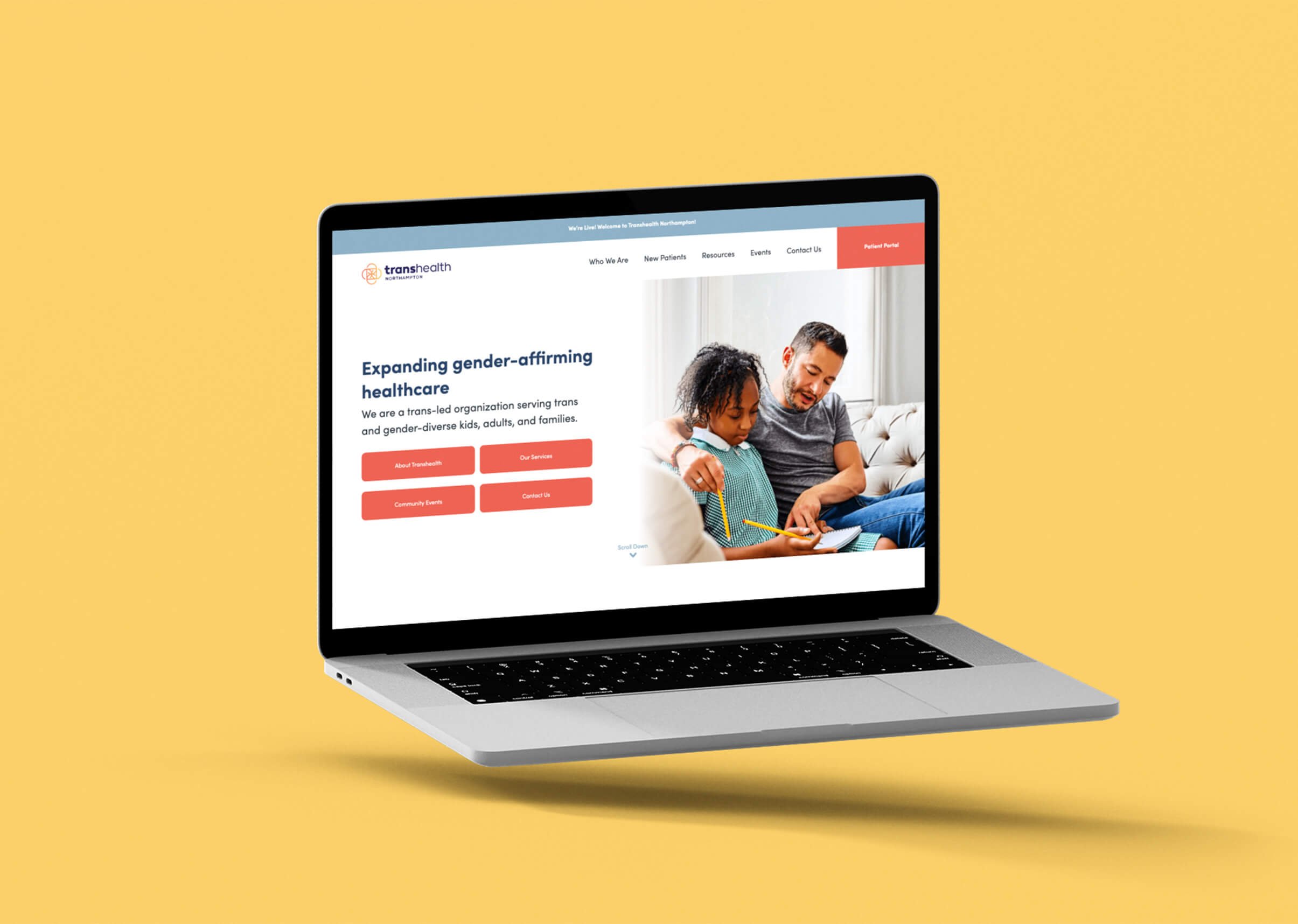
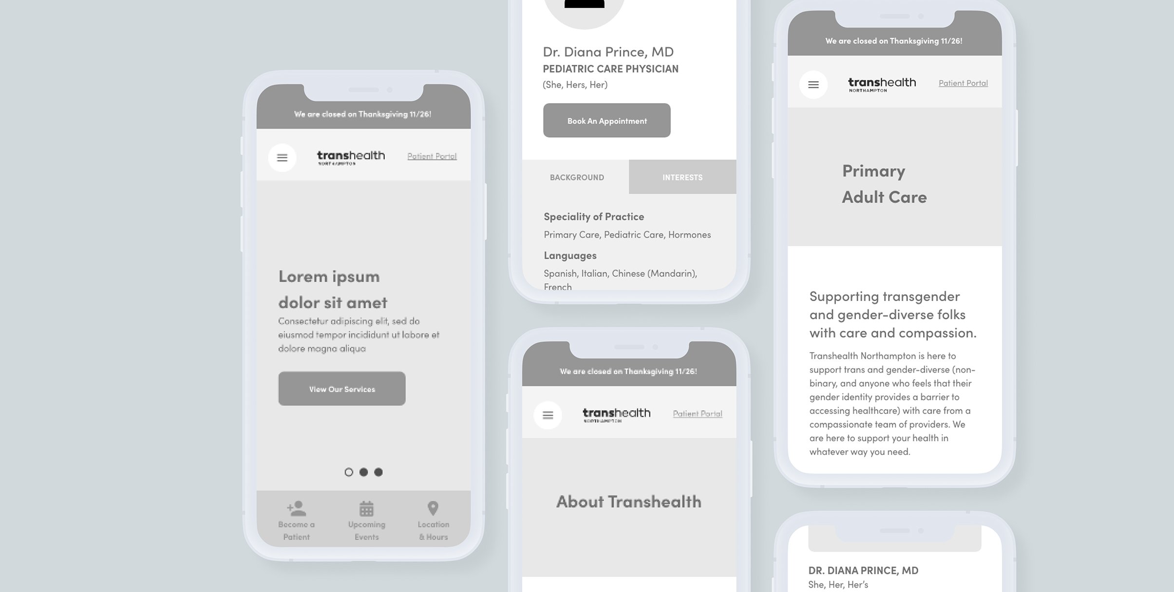
Partnering with Landry Communications, we worked with Transhealth to conduct further UX research into the needs of their prospective patients. This involved reaching out to numerous organizations across Western MA in order to solidify the core functionality and traits the website needs to serve up. With the insights from our UX research, we proceeded to create a clinical website that allowed patients to affirm the credentials of their care-takers, check applicable health insurance policies, refill prescriptions as needed, and access a vast library of media resources relevant to transgender & non-binary gender health and wellness.

Research & Discovery
Partnering with Landry Communications, we began the Discovery Process by engaging with the local LGBTQ+ communities, and organizations around Western MA. Results from the in-take survey, as well as results from The PATH Project report, reflected a general dissatisfaction and distrust of the traditional healthcare system, rooted in issues from lack of empathetic care to non-transparent insurance acceptance policies. In some cases, these issues end up keeping patients from coming back for their health needs. Furthermore, we found a greater disparity in the healthcare experiences between caucasian LGBTQ+ and QTBIPOC (Queer Trans Black Indigenous People of Color) individuals.
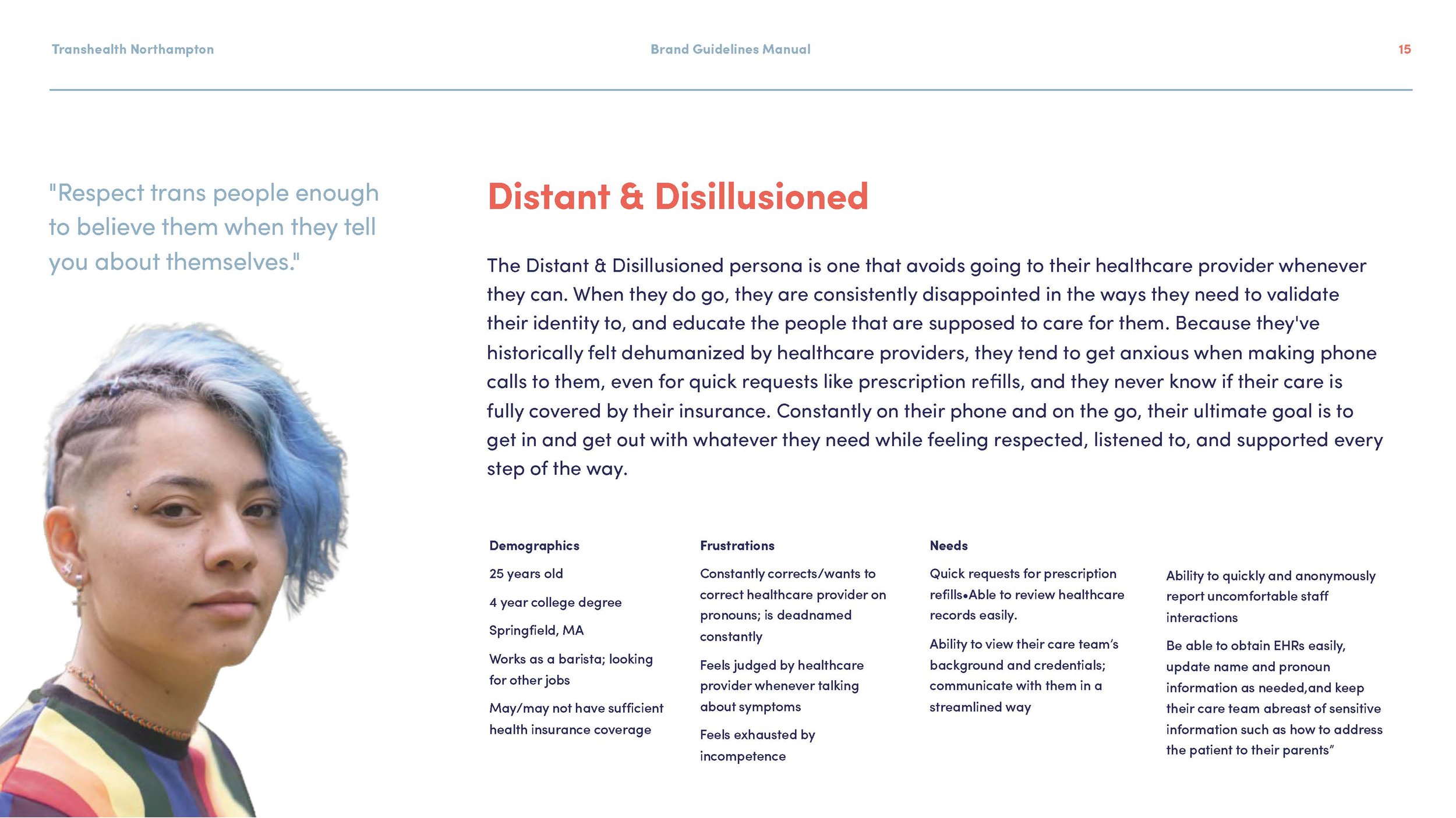
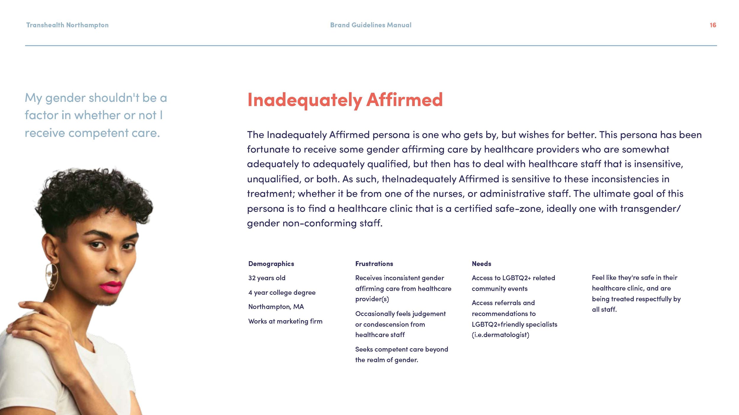
Insights from our intake survey allowed us to define two primary user communities within our audience. While the “Distant & Disillusioned” reflected those who avoid going to their healthcare providers due to lack of empathetic or quality care, the “Inadequately Affirmed” reflected those who experience varying inconsistencies in the affirming care they get, and are sensitive to the flaws in the system. It became clear to us that we needed to create an overall presence, through brand & website, that prioritized the patients in all aspects, all the way down to the smallest details. Everything we created needed to communicate hope, inclusivity, and warmth—reinforcing the message that when you walk through the doors or get onto the website, your health needs will be met, no matter who you are.
User Experience
To meet the pain-points of our primary audience communities, problem statements were developed to keep all stakeholders in line with how the website needed to work for each persona. Of the needs shared by both primary personas, we saw a need for community-building with other transgender and gender-diverse people, full transparency about medical staff qualifications, and a sense of belonging. While the Distant & Disillusioned needed to quickly request prescription refills, the Inadequately Affirmed wanted to check in on related LGBTQ+ events—either run by Transhealth or other organizations—and check staff credentials & training. Through site-mapping and mobile-first prototyping, we solved these problems by allowing for easy access to the Patient Portal in the navigation, as well as building out clinician & staff profiles centered around background & credentials.
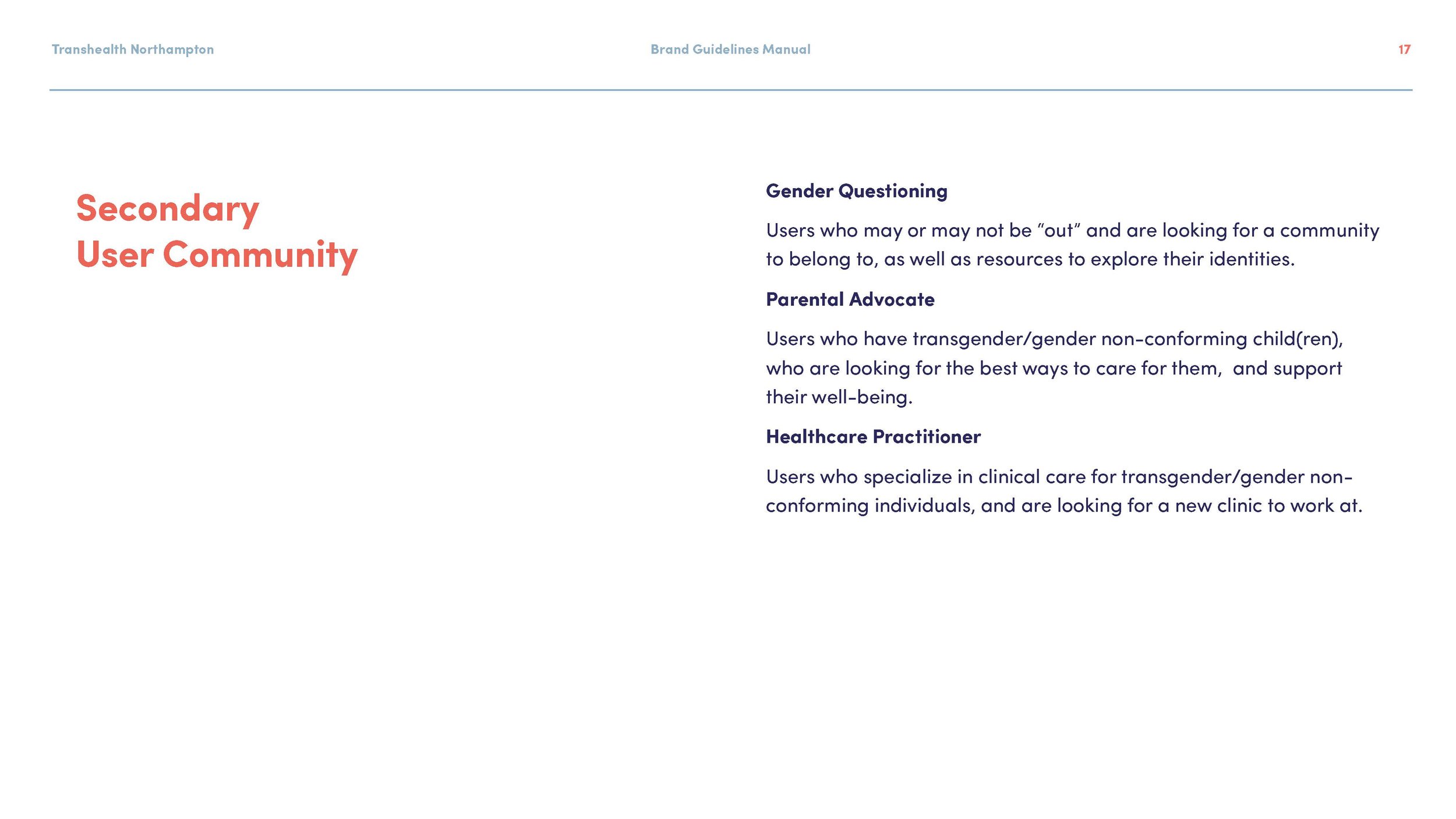
The biggest highlight to the website user experience? A Resources page with an extensive library of curated content, related to transgender and gender-diverse healthcare and other resources. This would be accessible to our primary personas, as well as our secondary communities which include parents of transgender/gender non-binary children and healthcare providers.
Furthermore, we found a greater disparity in the healthcare experiences between caucasian LGBTQ+ and QTBIPOC (Queer Trans Black Indigenous People of Color) individuals.
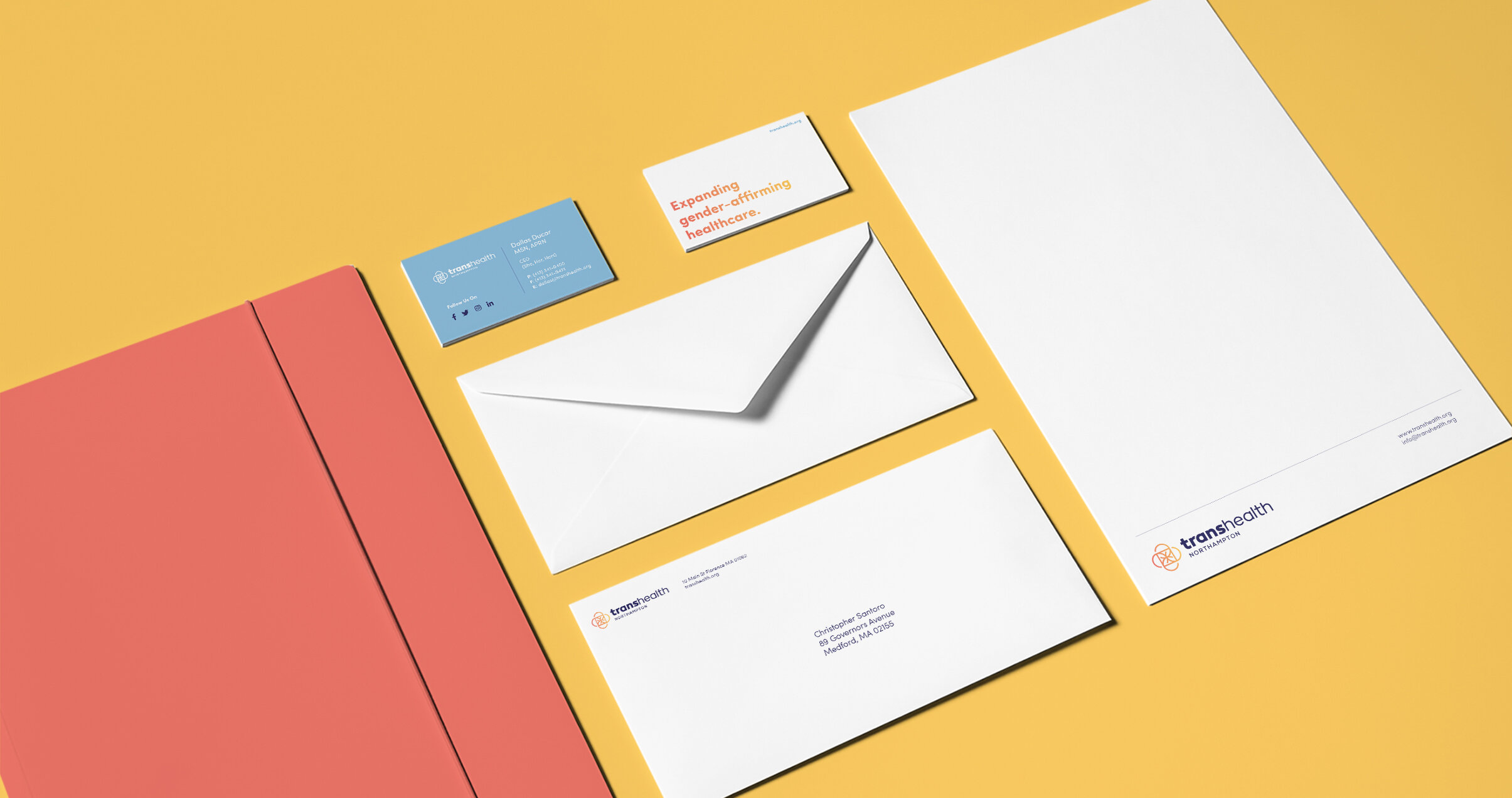
Interactive & Brand Identity
Our goal was to create an identity system that complimented the wordmark designed by graphic designer Taylor Smaldone (He, His, Him), while ensuring it met the primary audience’s needs for an empathetic, gender-affirming safe-zone. Stylescapes were crucial in establishing a brand direction, which also affected the decisions made while designing the UI for the website. For this project, we effectively designed the brand identity through the website UI, since the website was going to be a primary audience touchpoint. A modern, clean design style with fun illustrations and iconography, paired with a high contrast, gender neutral color palette, was a big step in making an optimal experience.
Towards the end of the Design Phase, we revisited the need for a logomark to pair with the wordmark. Through careful iteration, we came to an impactful final result, one that resonated with the organization’s mission to the core. Taking the vernacular of the medical cross, we incorporated elements of fluidity and intersectionality to create a unique rendition; one that would allow the organization and the LGBTQ+ community to “take back” their right to gender-affirming healthcare.


I have worked with Santoro Design on projects with three different clients, and each experience has been outstanding. The team combines unusually fine graphic design talent with a strong commitment to process. This means that projects move efficiently while eliciting and responding to the needs and ideas of the client. Every time I work with Chris and his team, I look forward to our next collaboration.
Christopher Landry, Founder & CEO of Landry Communications