Inside The Identity: All About The Webflow Rebrand

On October 5, 2023, the revolutionary no-code website building platform Webflow unveiled their new brand identity during their 2023 Webflow Conf event. And goddamn, is it impressive.
Now, if you’re not familiar with Webflow at all, Webflow is an all-in-one website building powerhouse that, for the past decade, has been spearheading what’s been called the “No-Code Revolution.” With traditional website builds, like with a WordPress website, designers hand-off finalized website assets and comps to a developer, who would then build the site with the HTML, CSS, and Javascript, which can take upwards of 1-3 months with time factored for bug fixes and QA. With Webflow, designers, developers, and other publishers are able to build the website with intuitive drag-and-drop blocks, a fully visual CSS properties panel, and built-in animations and interactions while Webflow writes clean and compliant code. Since it launched back in 2014, it’s taken the hearts of designers, developers, studios, and agencies on a global scale, and for good reason. It’s fast, it’s intuitive to use, and it empowers teams of all sizes; from small businesses and start-ups, to Fortune 500 companies like Dropbox and Netflix.
As a studio, we’ve watched Webflow not only grow but skyrocket since it entered the market. The possibilities are endless, and while we don’t specialize in its use (yet), we can’t help but marvel at what it’s capable of. It’s become a true household name in the realm of website design, and we can’t help but be stoked by this newly unveiled rebrand. Here’s why:

Vlad Magdalin, CEO of Webflow, talking about the rebrand at Webflow Conf 2023.
A Meaningful Mark For A Superpowered Mission
What’s really captivating about the logomark itself is that the three pieces that make the “W” represent the building blocks, or “superpowers” that make Webflow what it is: HTML, CSS, and Javascript. The revamped logo is sleek, minimalistic, and effortlessly modern, showcasing a level of simplicity that is both refreshing and captivating. The new branding injects a fresh burst of energy into the overall aesthetic, making it impossible to ignore.

The previous logotype had gone through some minor changes throughout the years, but had otherwise stayed the same

The new rebrand features a balanced lockup of the 3-piece logomark and a new logotype set in Webflow’s own WF Sans.
Whereas the previous mark was a visually stylized wordmark with an extrapolated “w” for a standalone mark, this new logomark beautifully encapsulates Webflow's unwavering commitment to cutting-edge innovation and user-friendly design, establishing it as a true pioneering force in the industry. After all, Webflow’s mission is simple: to give development superpowers to everyone.
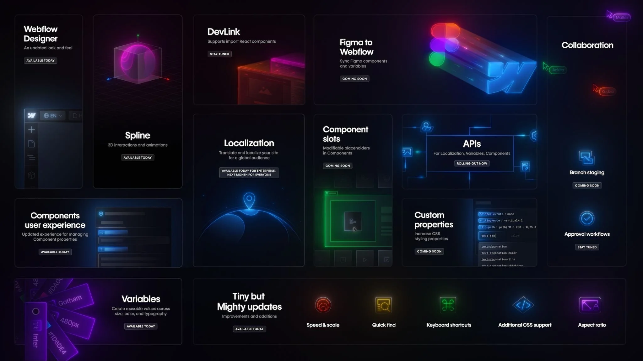
All of the new feature releases coming up soon, which were unveiled at the Webflow Conf 2023 keynote. Image from Webflow
A Refreshingly Dark Aesthetic
Webflow has always embraced a futuristic look-and-feel with the high contrasts darks and lights, but now seems to fully embrace a dark-mode design with more glowing neon-esque treatments of colored assets. The palette still has moments of white and off-white within certain sections, but the darker treatments have now taken on a more dominant role.
Now, there are many companies out there that take similar approaches, but Webflow’s new visual identity also employs a bit more dimensionality with its graphic elements, seemingly referencing the newer controls designers have over 2D and 3D graphics. What we appreciate the most about this is that every detail relates back to the mission. Everything looks and feels powerful, the way Webflow wants its users to feel.
Lastly, this new aesthetic is made complete with the incorporation of their new custom typeface, WF Visual Sans, which replaced their previous font family Graphik™. With a larger x-height and geometric design that feels sharp yet personable, it really gives additional power to their messaging.
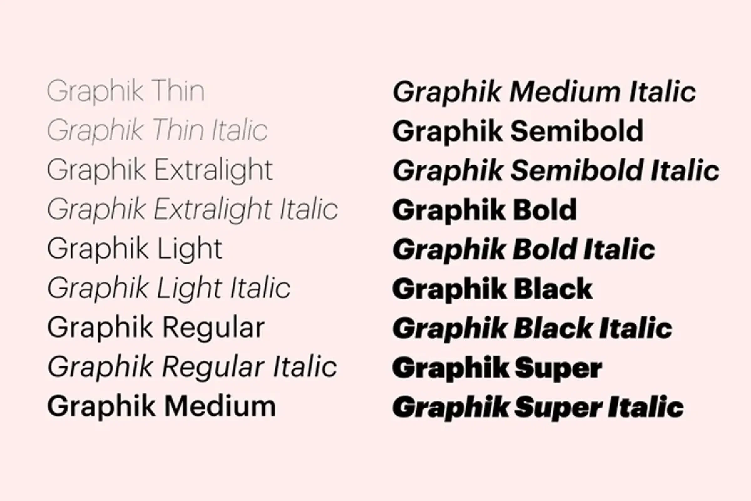
Graphik™ typeface made by Commercial Type.

WF Visual Sans has two families, one for headings and the other for text (WF Visual Sans Text). The Sans Text family feels more grotesk in its design, sharing some similar vibes too Graphik, whereas the heading typeface is rounder and sharper for display.
A Stunning Reception and Bright Future For Webflow
In short, the in-house team at Webflow have done an exceptional job in completely overhauling their visual identity to align with their platform's new direction and enhanced features. The result is a design that not only exudes elegance and sophistication but also radiates an unmistakable sense of creativity that is synonymous with Webflow. It’s empowering, it’s beautiful, and it makes you want to dive in.
A big congratulations to the entire Webflow team, but especially the Brand team for making this new rebrand so successful.