Ompractice
Branding | Interactive | Creative Production
Project Duration: January 2018 – March 2018
Studio Services: Branding | Content Creation
Special Thanks & Credits To:
Additional Design Collaboration by Elyse Bogacz Creative
Project Information
Background
Ompractice is a platform that completely changes the experience of practicing yoga at home. The platform allows students to take live, online yoga classes whenever, wherever. Teachers can host live classes for students, with the added ability to also see how students are doing in case they need to correct form.
The Challenge
As a newly-founded start-up, Ompractice was in need of a visual identity system that championed their mission of providing a place of “practice” for their users—all from the ease and comfort of their own homes.
Our Solution
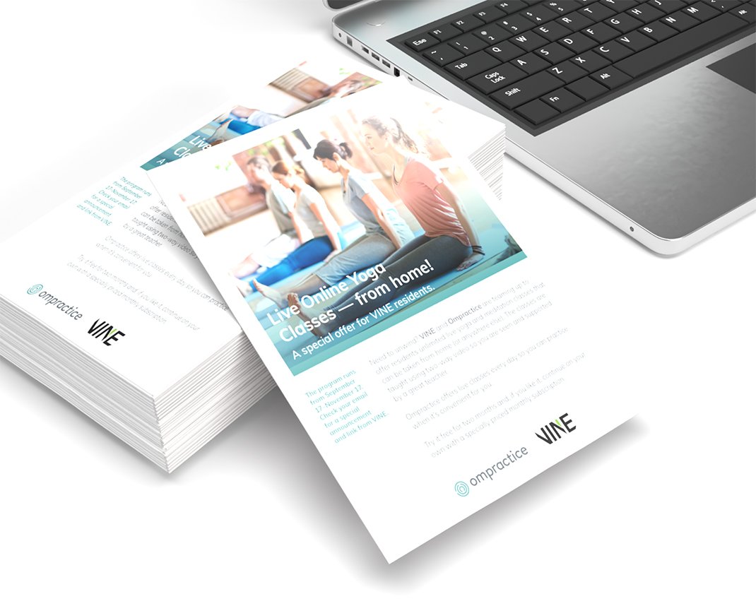
Partnering with product design consultant Elyse Bogacz Creative, we worked alongside the Ompractice team to create a sleek and elegant visual identity system, as well as a set of tradeshow and marketing materials for their initial launch.

Brand Identity
Even before getting into the design phase, we knew that there would be a challenge to avoid the overly trendy aspects of the yoga industry. While this was rooted in yoga practice, it was clear to us that Ompractice was a tech-company, and the branding needed to reflect that.
Upon kick-off and initial moodboarding exercises, we went into an exploration of numerous sketches & concepts inspired by yoga and its practice. As we went further into iterations, we began to fixate on the idea that the concept of “practice”—not just in yoga but in most things—is inherently non-linear, and sometimes walls are hit along the way, which brought in the metaphor of the labrynth. The palette was created with two user audiences in mind: practitioners who sign up for the classes, and the teachers who host them.


As we went further into iterations, we began to fixate on the idea that the concept of “practice”—not just in yoga but in most things—is inherently non-linear, and sometimes walls are hit along the way, which brought in the metaphor of the labrynth.


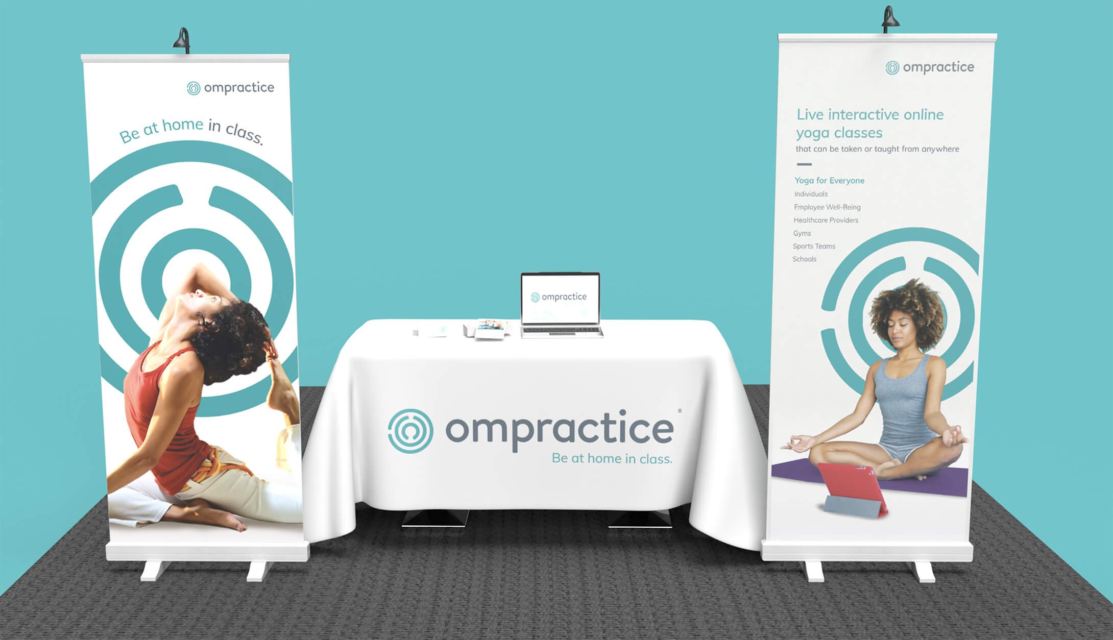
Brand Implementation
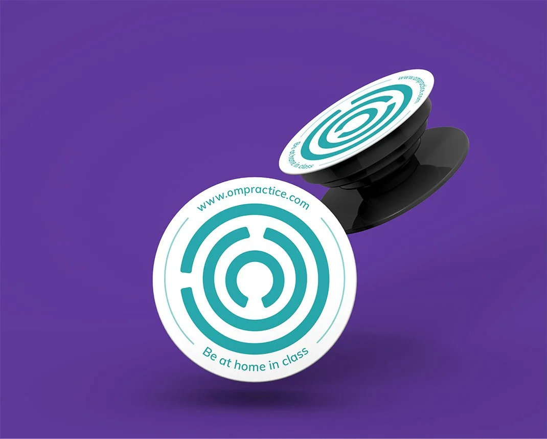
Further comps testing with the labrynth made it clear to us that the mark itself had a ton of potential for brand value. Used as the primary design element across business stationery & discount cards, the mark superimposed behind practitioners on banners and posters pushed the idea that anyone could use the platform and become one with their practice journey.