Beyond Booze
Project Duration November 2021 – March 2022
Studio Services: Branding | Package Design | Website Design | Content Marketing Design | Copywriting
Project Information
Background
Beyond Booze is a start-up cannabis canned beverage company looking to change the way we think about social drinking. Started by Tasneem Mitchell in late 2021, Beyond Booze creates cannabis-infused cocktails and mixers that allow people to enjoy themselves in a healthy and safe way, free of hangovers or night-before regrets.
The Challenge
To kick-off their growth, Beyond Booze required a brand strategy and image that catered to their socially conscious, canna-curious target audience.
Our Solution
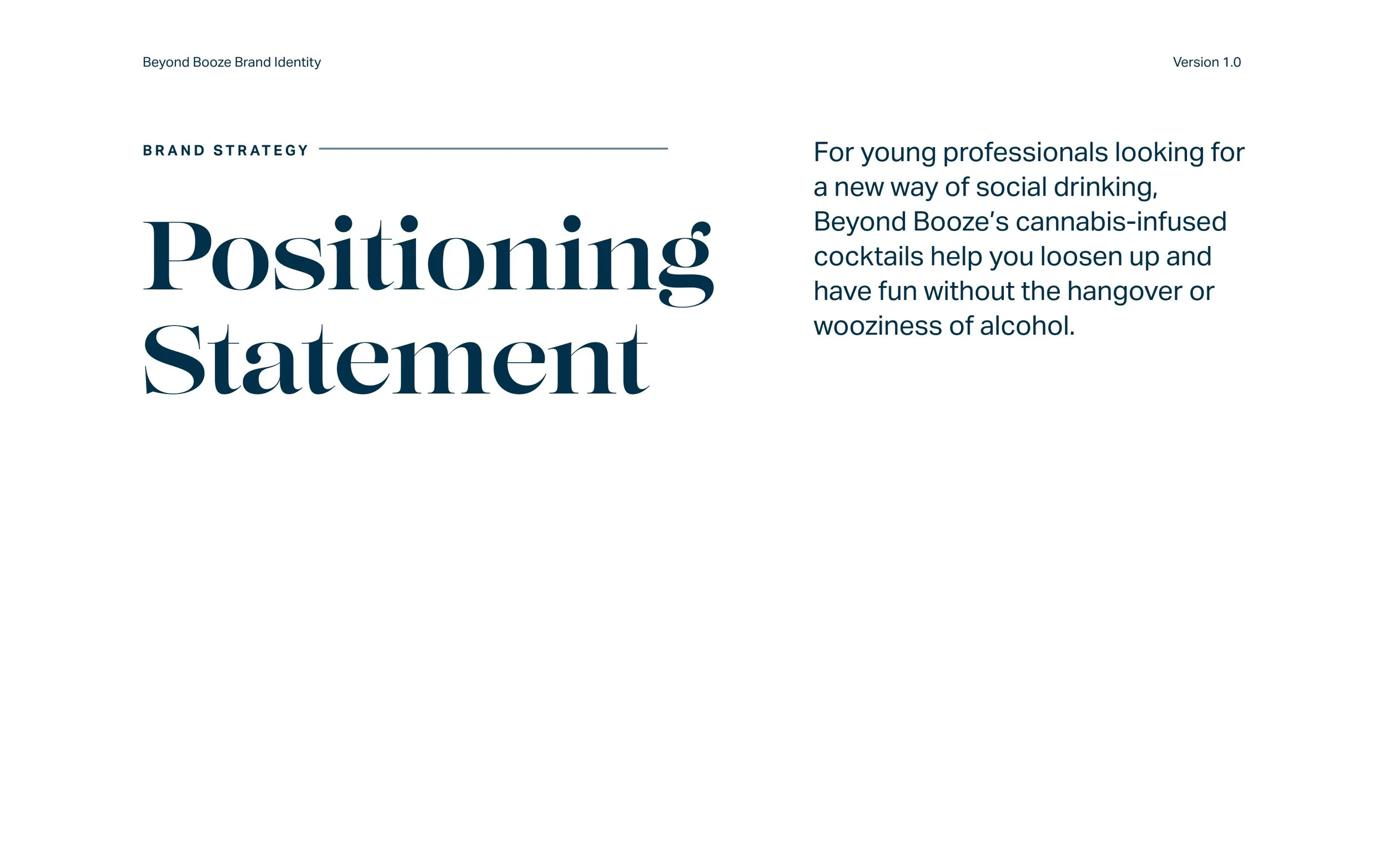
We worked with Beyond Booze to establish a brand strategy and visual identity system that positioned them as an “elevating” beverage, matching it with elegant & sophisticated graphic language and story-telling.
Brand Strategy
With an ever-growing cannabis industry that has boomed since state-level legalization, Beyond Booze found itself in a highly active market of cannabis-infused food and beverage products. Beyond Booze noticed the gap in the market for bar-quality beverages in the cannabis CPG space and sought to make their mark with delicious, bar-quality beverages for the mindful, “canna-curious” social drinkers. The fast-acting cannabis infusion allows for a pleasant buzz without the morning-after regrets.
The difference between them and other brands? The story and the mission. With a founder certified in mixology and with a Masters of Science in medical cannabis, the company is BIPOC-run, female-owned, and looking to break through the “grass” ceiling to set the example for other BIPOC cannabis business owners.
We worked with Beyond Booze to identify their brand attributes as empowering, upbeat, and congenial. These attributes set the standards for all design and messaging decisions.

Brand Identity
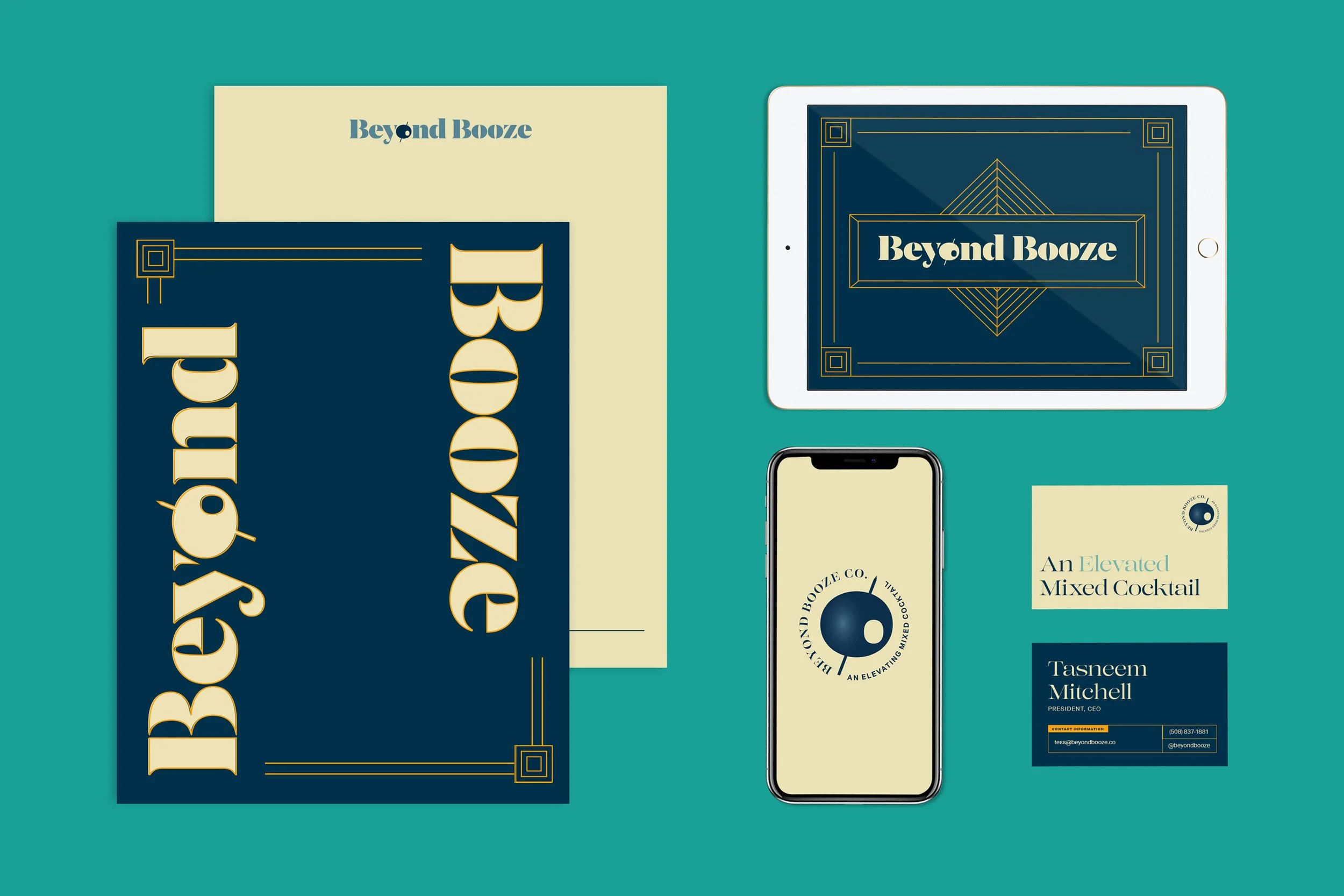
When thinking about high-end cocktails and social gatherings, we knew we had to look back at design history and fixate on the Art Deco movement. Elegant geometric patterns and motifs with beautiful display typography came together within initial stylescape iterations. Stylescapes are typically the first part of the design process to ensure that a creative direction is not only agreed upon, but is inherently rooted in Discovery Phase insights.
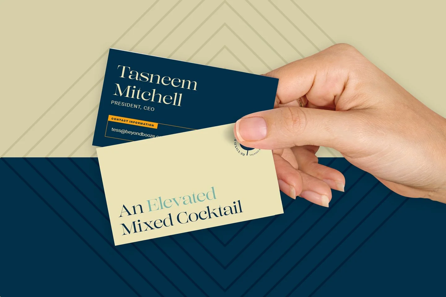
The primary logotype is a customized Domaine Display Extrabold with the toothpick in the martini-inspired “o” olive pointing upwards. Further realized through the design of a robust logo family, the brand maintains flexibility from print, to web, to the product on the shelves. The refined visual language that followed unified our brand strategy and attributes with the narrative of an “elevating” Gatsby-esque cocktail party.

Further realized through the design of a robust logo family, the brand maintains flexibility from print, to web, to the eventual products on the shelves.

Rejected Concept Sketch: “Sultry Speak Easy”

Final Beyond Booze Logotype


Interactive
To set the stage for a new corporate website design, we needed to create a temporary web presence that would reflect the newly designed identity and take inquiry messages from manufacturers and other vendors.
With subtle load-in animation and Age Verification check on page-load, we built a customized responsive landing page experience on Squarespace, utilizing the SquareKicker plugin.
