Beantown Bootcamp
Project Duration: June 2020 – Present
Studio Services: Branding | Package Design | Website Design | Content Marketing Design | Copywriting
Special Thanks & Credits To:
Photography by HIVE.Studio
Project Information
Background
Beantown Bootcamp is a gym & fitness center located in the heart of Boston. Run by founder John Wayman back in 2001, the gym prides itself on class-based, bootcamp-style classes that take place both indoors and outdoors.
The Challenge
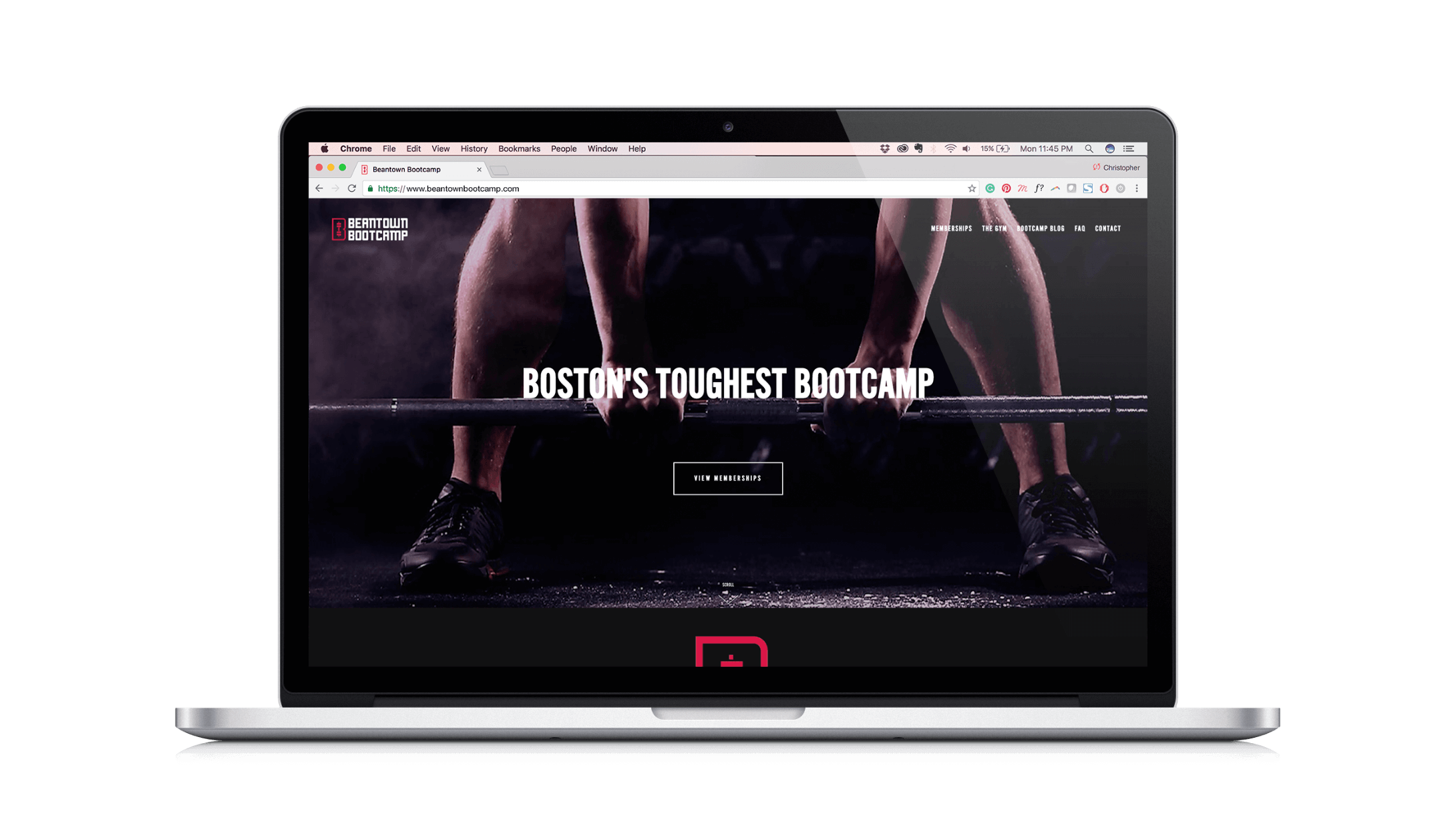
Beantown Bootcamp’s branding hadn’t been touched since it started, so it was very outdated. Not only that, their website had a disjointed user experience and mismatched design, which made it hard for new members or prospects to book classes.
Our Solution
We worked with Beantown Bootcamp and our longtime collaborators HIVE.Studio on completely revamping the look-and-feel of the gym, while also creating a new website that featured a more streamlined and exciting way to book classes.

Brand Strategy
What separates Beantown Bootcamp from the average Boston fitness center? The fact that it’s primarily small classes lead by certified physical trainers? Maybe it’s because at one moment you’re doing deadlifts and strength training, and the other moment you’re running up and down Beacon Hill. Maybe it’s because every workout is driven by high-octane music that gets members to the finish line. Needless to say, unlike the average gym, a Beantown Bootcamp workout is a full-on fitness experience supported by a tightly-knit, motivational community.
Their ideal clientele was made up of young to middle-aged professionals that don’t work out to simply maintain. They want to continuously excel and crush personal records. They don’t want to simply clock-in and out at a gym, they want to elevate their fitness to a new level. Taking this into consideration, we knew during the design phase we had to create a brand presence that was as kick-ass as the members .

Brand Identity
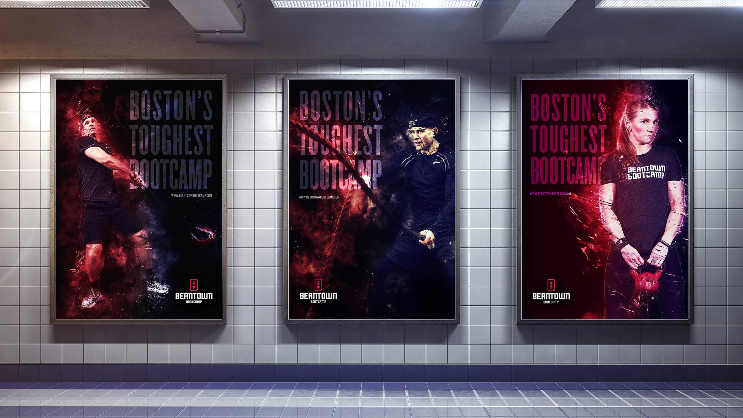
The previous logo was a single lock-up with a distinctive “B” mark. We felt that refining it and giving it new meaning, would be the most intelligent solution. A new “B” mark was created for better functionality and consistency with its brand voice, with the logotype being customized from the same logo typeface. Finally, a cohesive logo family was created for thorough implementation across different media.
The design system was created to be simple, but impactful, with a use of larger typography and bold, energizing colors.

Fully Human Supplements 2019 Logo

Fully Human Supplements Rebrand
Taking this into consideration, we knew during the design phase we had to create a brand presence that was as kick-ass as the members .


Interactive
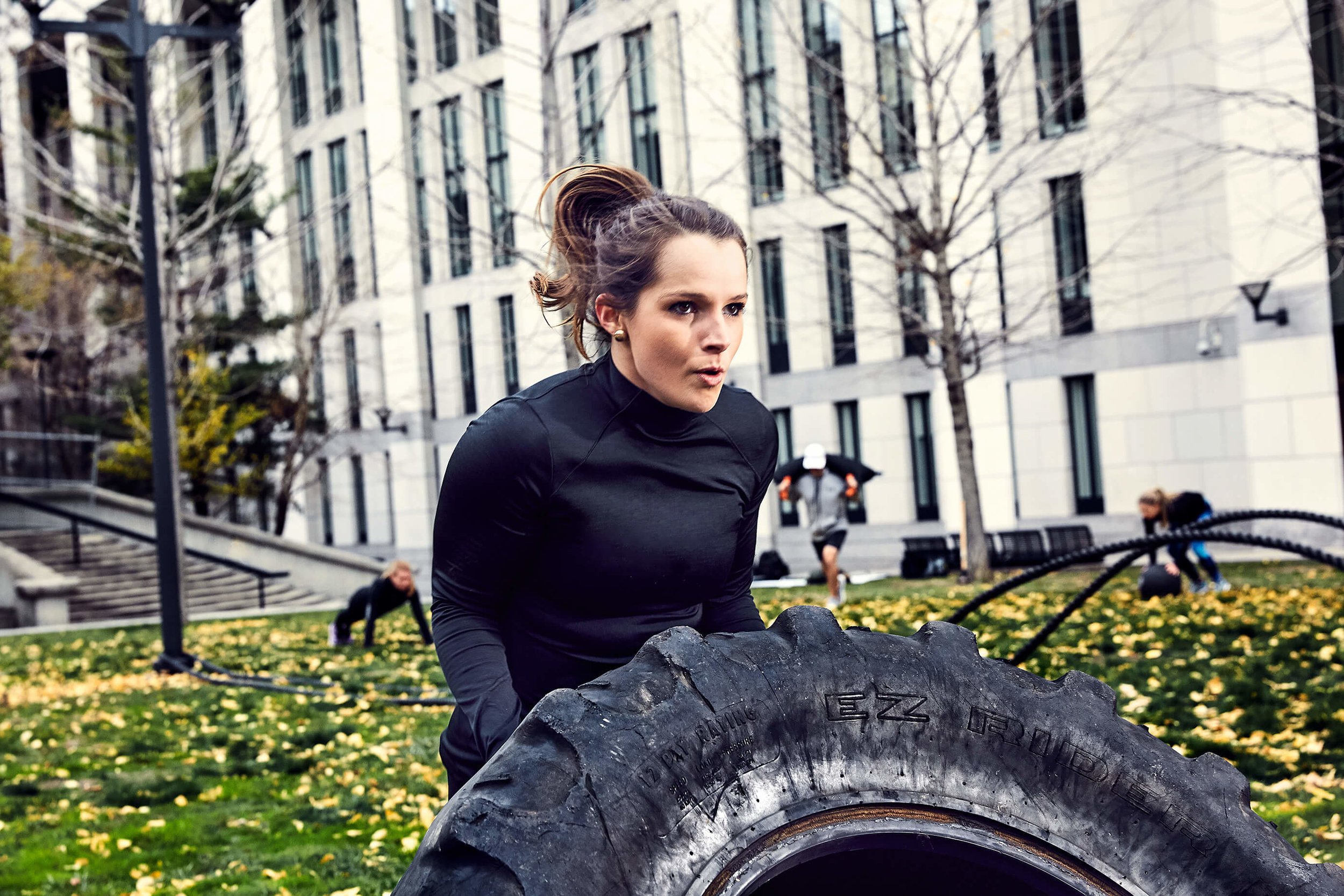
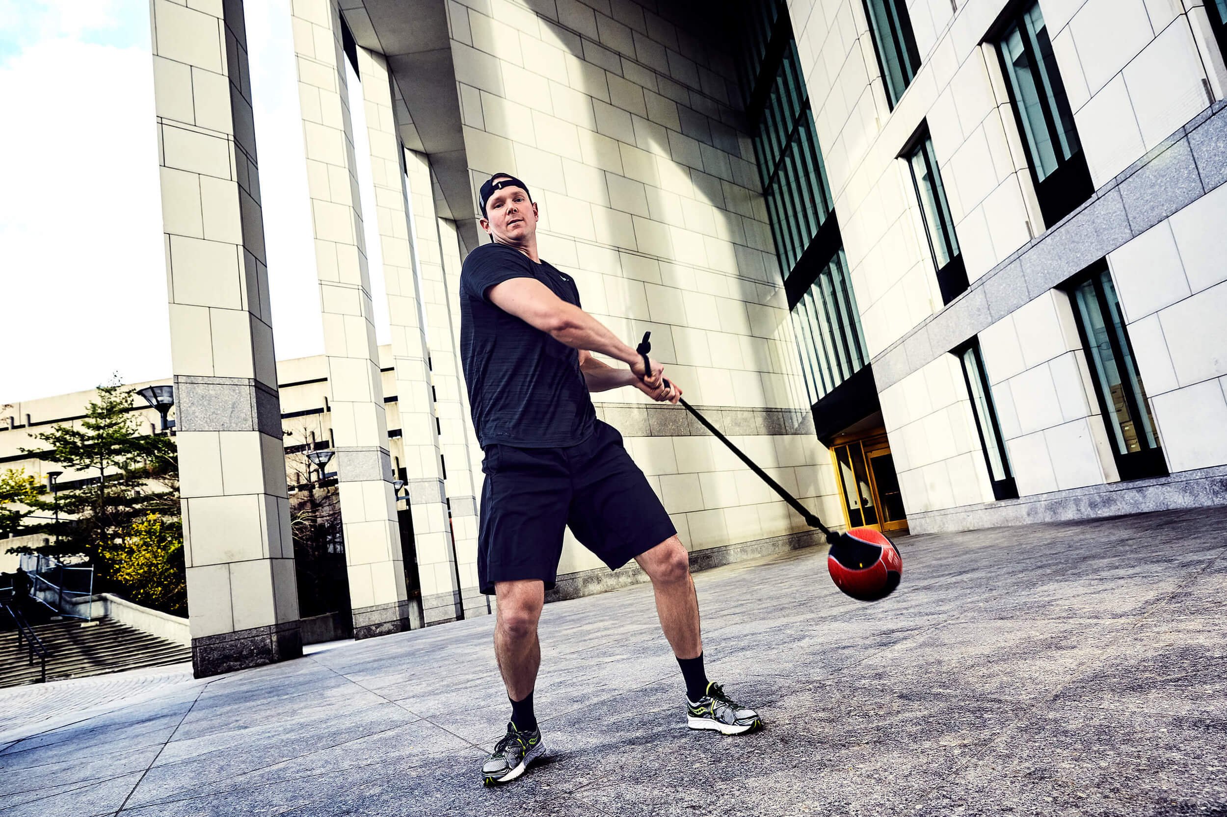
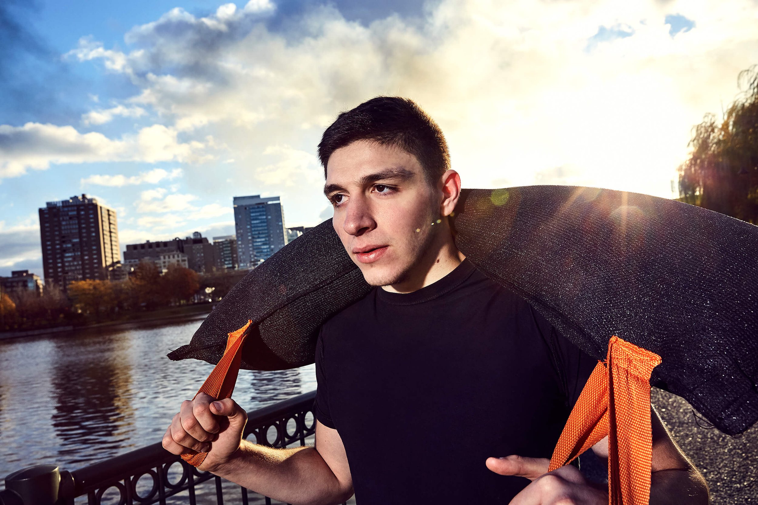
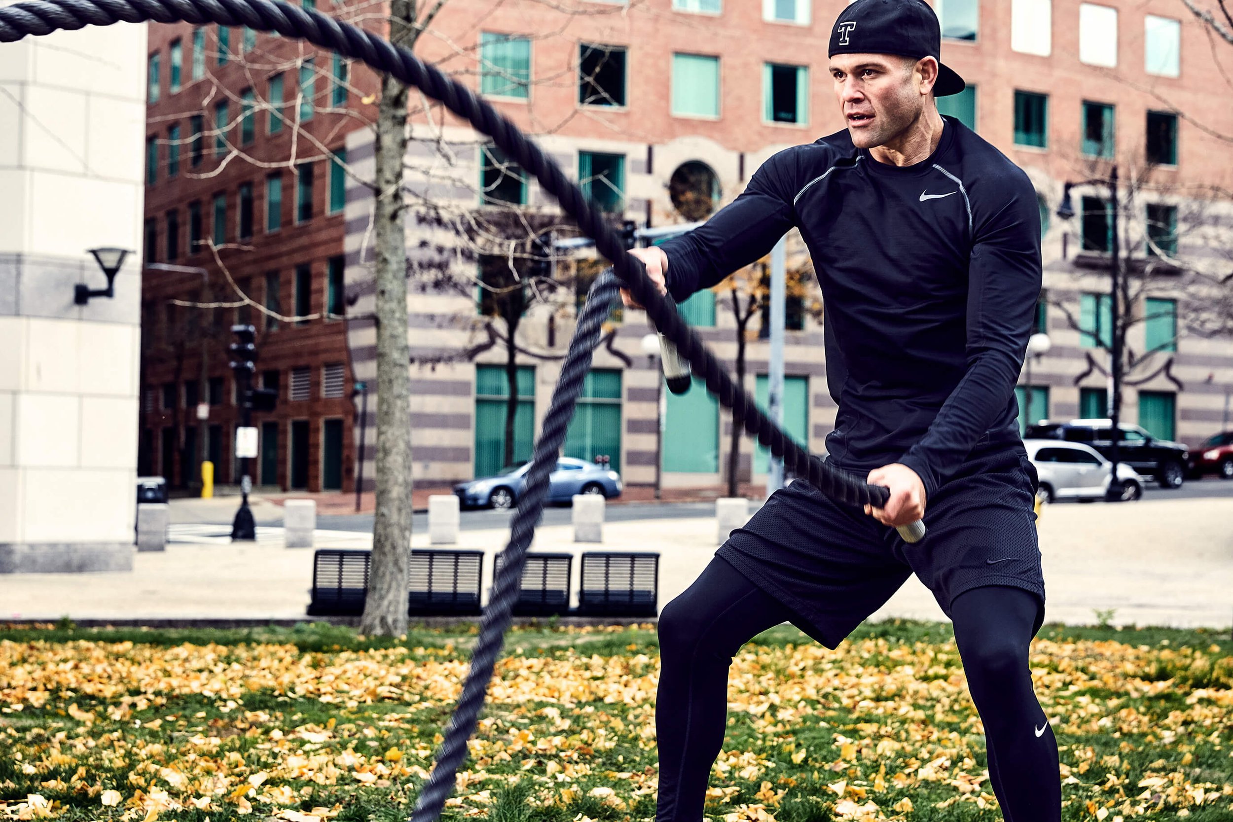
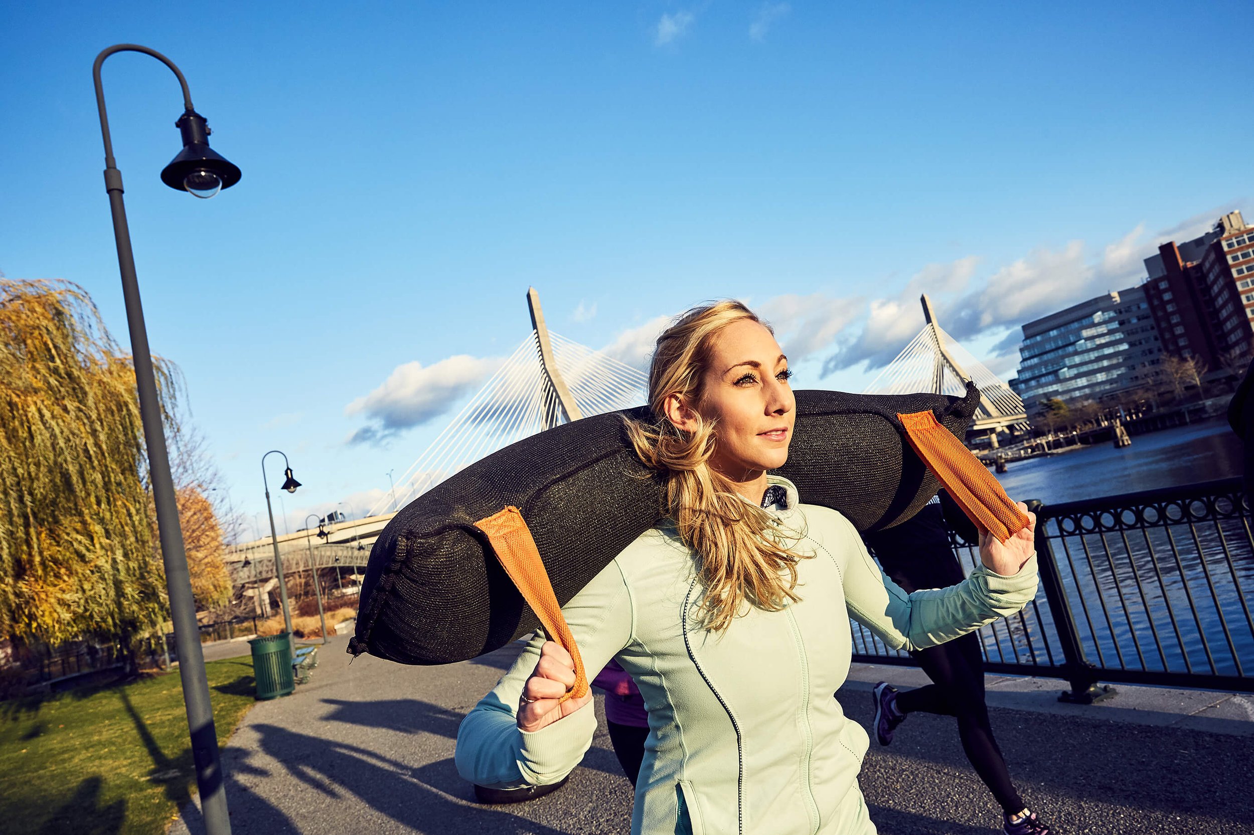
To bring everything together for the new website, we worked with photography studio HIVE.Studio on setting the direction for the photoshoot. Our goal was to fully capture the Beantown Bootcamp fitness experience; from strength training and cardio in the gym, to outdoor workouts in the Beacon Hill area.
The previous website was difficult to navigate, had a confusing registration process, and was slow-loading; a killing blow for any website’s SEO. For any gym website that offers classes, the goal of any prospective member is to see the classes offered and register. We worked with Beantown Bootcamp on creating a fully-immersive website experience that not only communicated the bad-assery of the brand, but was also easy to update and integrated with MindBody’s API for class scheduling and purchases.

“…Chris really spent the time researching what made our business unique and I was truly blown away by how he captured our "bad-ass" image/reputation in our new logo and website design…The new look and feel of our business made our existing customers proud to be members, and we absolutely had an uptick of attracting new sustainable clientele. Do yourself a favor and hire Chris for all your rebranding and website design services.”
John Wayman, Founder & Head Coach